Choosing Colour Schemes for Australian Homes
In-Short
- Pick colours based on your vibe, lighting at home, and long-term design goals.
- Exteriors need street-appeal; interiors need comfort, personality, and cohesion.
- Neutrals and earthy tones feel timeless and resale-friendly for Australian homes.
- Test swatches in different daylight because Aussie sunlight is dramatic.
- Build flow by connecting interior palettes to your facade and outdoor living.
Choosing colour schemes for houses is honestly the biggest glow-up moment of your build journey. It shapes your home's personality, mood, and long-term appeal. Whether you want a soft coastal palette, earthy bush tones, or modern minimal neutrals, the right colours make your space feel curated, intentional, and future-ready.
Let us break down a smart approach to selecting colours for your new Australian home.
Why Colour Matters More Than You Think
Colour is not just paint on walls—it's vibe-engineering. Your palette impacts emotion, room flow, furniture decisions, lighting feel, and even resale value. The best palettes stand the test of time and don’t force you into redecorating every year.
Colour Psychology Cheat Sheet
- Warm neutrals = cosy, inviting, homely energy
- Cool tones = fresh, minimal, sleek interiors
- Earthy tones = grounded, relaxed, Australia-coded vibes
- Deep accents = character, sophistication, visual drama
A smart move many homeowners take is starting with neutrals, then elevating with texture, timber, and accent décor.
For timeless inspiration, explore Coral Homes classic range colour schemes, showcasing cohesive palettes that never go out of style.
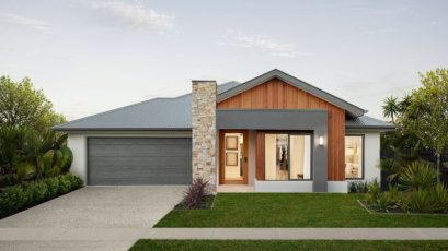
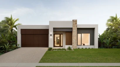
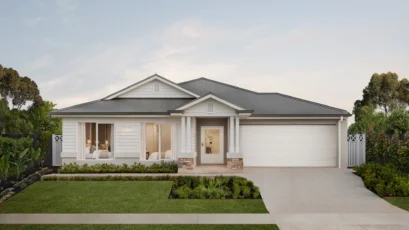
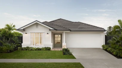
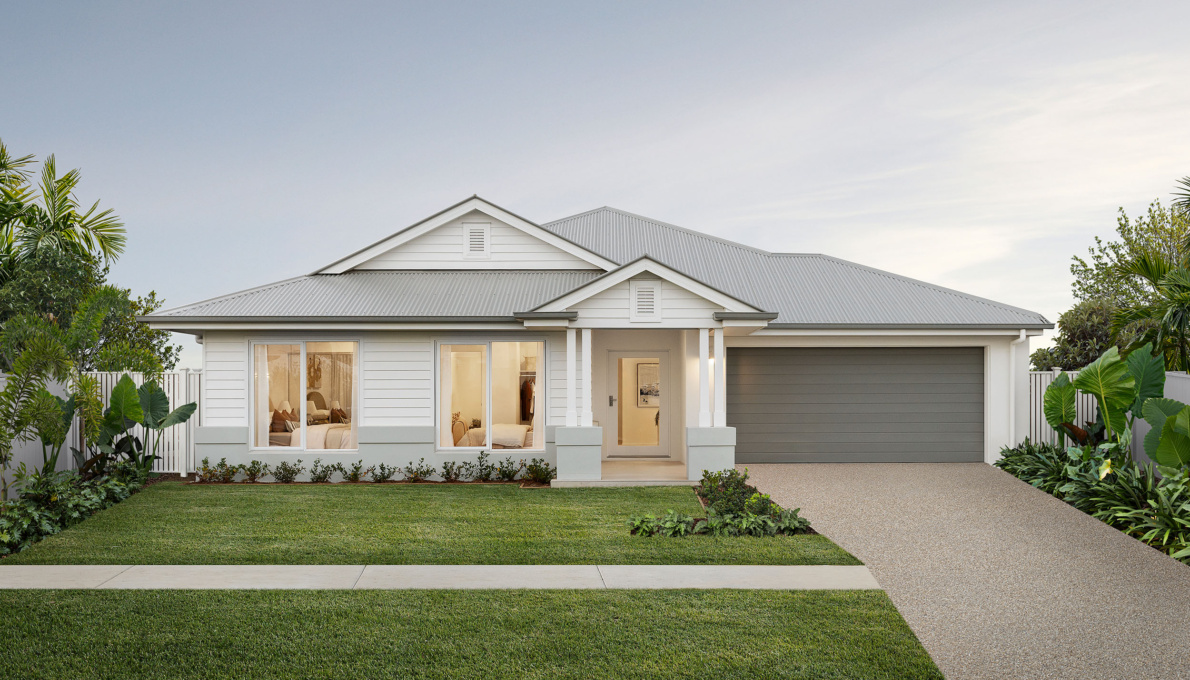
Colour Schemes for Houses Exterior
Exterior colour schemes are all about street presence and lasting appeal. Harsh sunlight, coastal reflections, and bush surroundings all influence how colours show up in Australia.
Exterior Colour Rules That Always Win
- Anchor with a neutral base tone
- Use trims and roof colours for contrast
- Add a statement texture or tone (stone, timber, steel)
- Avoid overly bright shades that glare under strong sun
- Check colours in morning and afternoon daylight
Popular tones include warm whites, muted sage, greige, soft charcoal, and warm stone.
Browse examples in the Coral Homes modern house designs collection for practical applications.
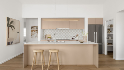
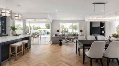
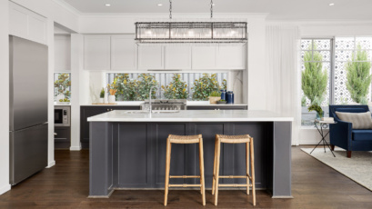
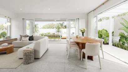
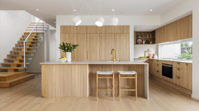
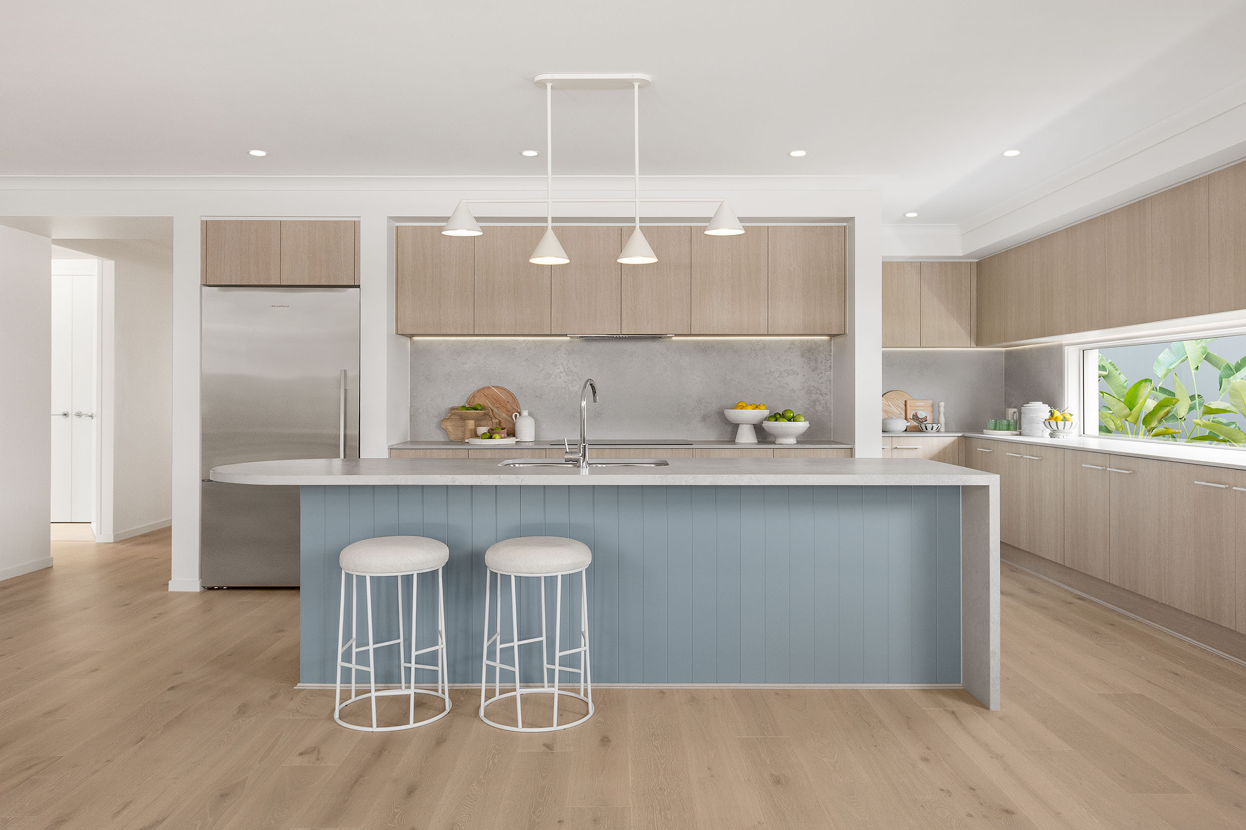
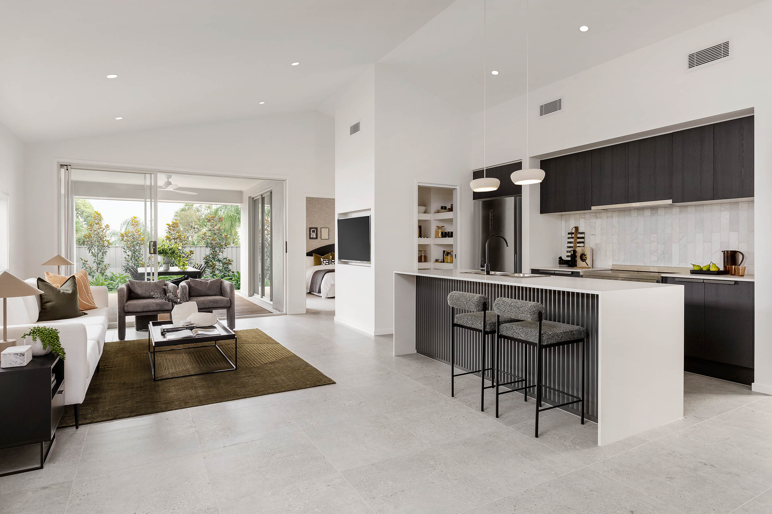
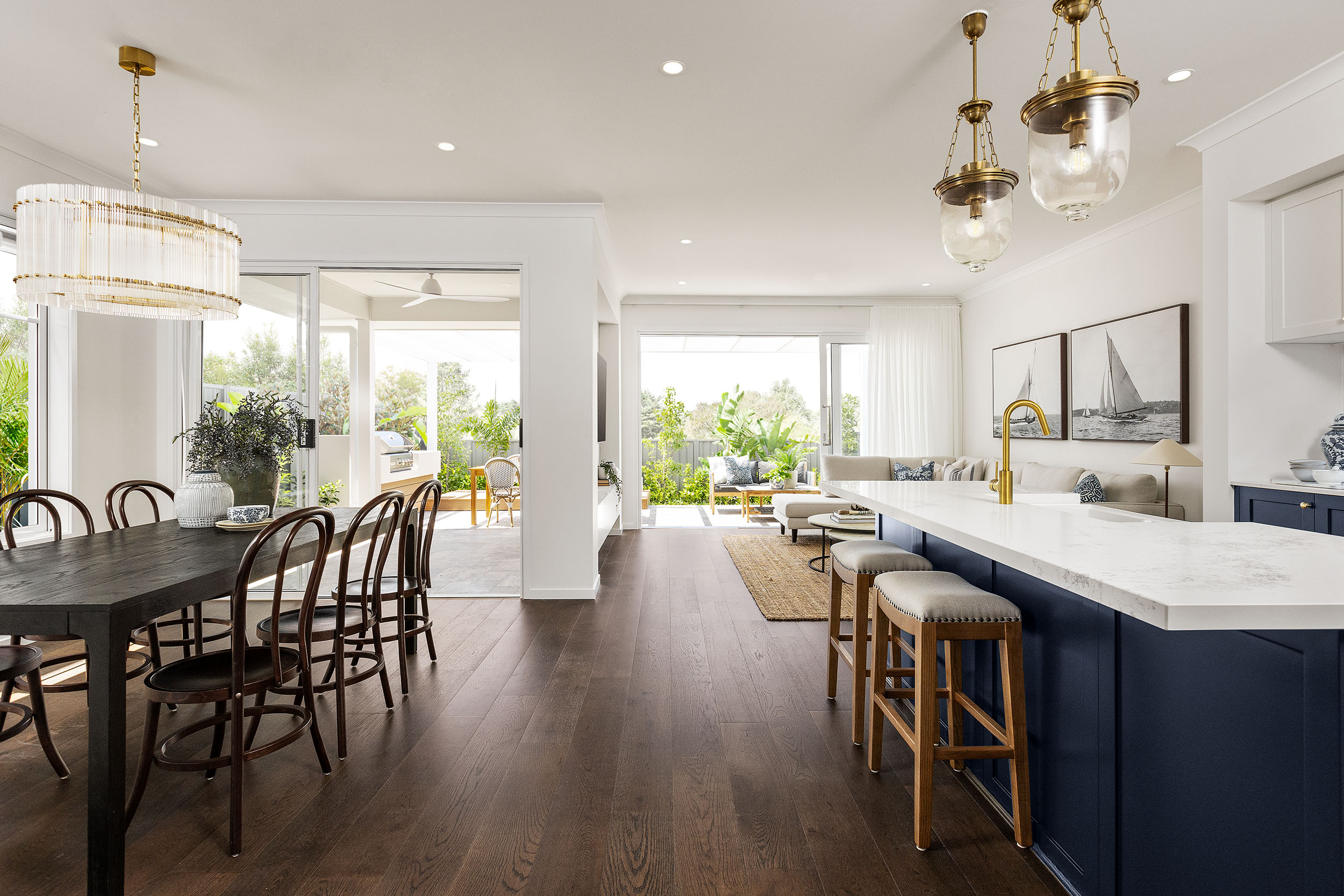
Colour Schemes for Houses Interior
Interior tones should create flow, frame natural light beautifully, and allow your styling personality to shine.
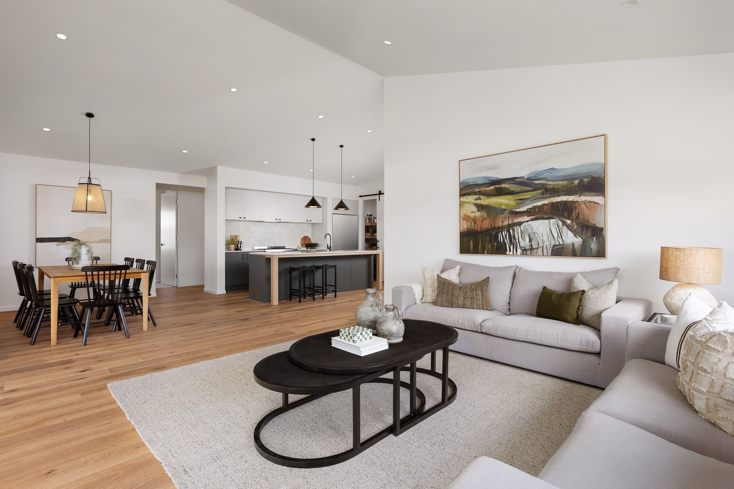
Classic Aussie Interior Palettes
- Soft whites + warm beige + oak timber
- Greige + charcoal accents + brushed brass
- Clay, sand, eucalyptus + textured fabrics
- Black framing + crisp white + stone textures
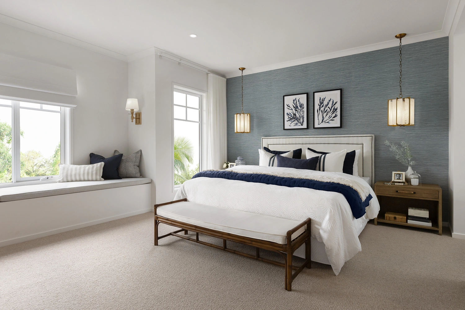
Practical Placement Tips
- Keep main living walls neutral for longevity
- Use darker tones in media rooms for cosy ambience
- Add soft colour in bedrooms for calm
- Experiment with moodier tones in powder rooms
See beautiful neutral-plus-accent combinations inside Coral Homes classic home designs.
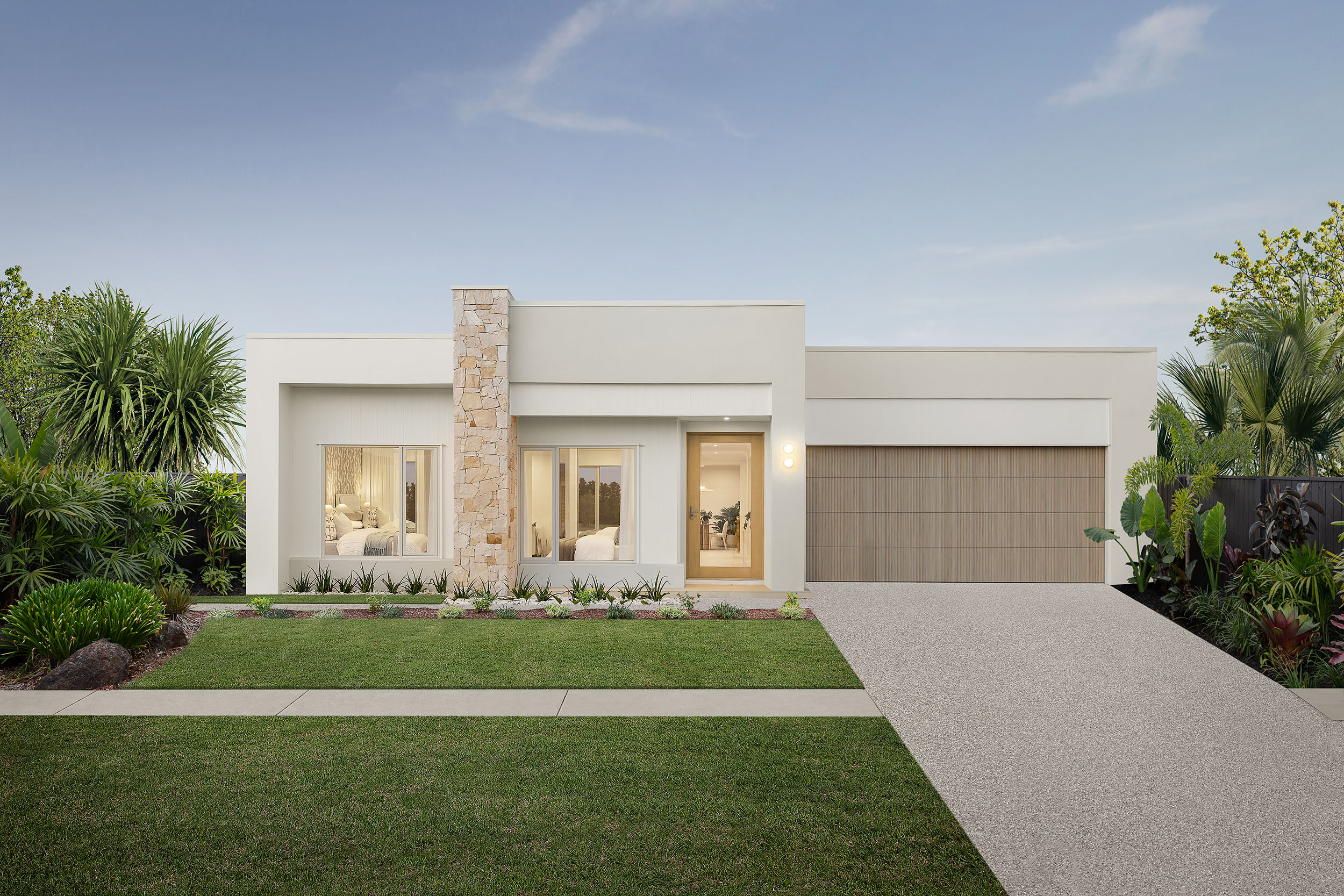
Colour Schemes for Australian Houses
Australia’s aesthetic is nature-inspired, breezy, earthy, coastal, and low-key luxe. These palettes feel grounded rather than loud.
Australian Style Inspiration
Coastal tones
- Seashell white
- Sand beige
- Seamist green
- Driftwood timber
Urban luxe
- Greige
- Matte black trims
- Porcelain white
- Veined stone
Bushland earthy
- Olive
- Clay
- Eucalypt
- Ironstone grey
Every climate zone hits colour differently. Coastal = bright sun + reflection. Bush = muted light + foliage shadows.
See real palettes in action inside Coral Homes Display Homes.
The Role of Light, Space, and Finish
Lighting changes everything. A shade that looks creamy in-store may look stark at home. Consider natural light direction and warmth.
Light & Tone Tips
- North-facing — warm light, suits cooler tones
- South-facing — cooler light, suits warm neutrals
- West-facing — golden hour glow (beware glare)
- East-facing — soft morning light, great for calm palettes
Paint Finish Guide
- Matte — sophistication, hides imperfections
- Low sheen — durable for busy spaces
- Semi-gloss — crisp trims
- High gloss — bold modern accents
See how paint interacts with natural light through Coral Homes virtual tours.
Putting Together Your Perfect Palette
Step-By-Step Palette Strategy
- Pick your exterior anchor tone first
- Build interior core neutrals that complement it
- Choose accent tones or textures for depth
- Test swatches on walls and boards
- Layer with décor, fabrics, stone, and greenery
Material Pairings That Always Hit
- Timber + cream + stone
- Black + white + warm timber
- Eucalypt + sand + soft grey
- Clay + warm beige + natural linen
FYI Trend Alert
- Beige is back
- Warm tones > cool tones
- Textures > patterns
- Nature-inspired hues > artificial brights
Explore curated style spaces inside our Coral Homes display homes.
Checklist Before You Finalise
- Does the palette reflect how you want to feel at home?
- Have you tested colours in different natural light?
- Is the flow consistent across key living zones?
- Will these tones age gracefully?
- Do finishes and materials align aesthetically?
Design fatigue is real during a build, so a neutral base saves future stress while still looking chic, modern, and expensive.
Key Takeaways: Colour Game Strong
- Pick tones based on lifestyle, location, and natural lighting patterns.
- Neutral bases with earthy or coastal accents feel timeless in Australia.
- Prioritise flow from exterior to interior for polish and cohesion.
- Let furniture and textures do the trend-switching—not paint.
- Test swatches in daylight and compare materials together before finalising.